Label Design: Mistakes, Templates, Libraries, and Best Practices
Label designer software is a powerful tool that allows users to create high-quality and professional labels for a variety of applications. However, creating a great label requires more than just using the software. There are many common mistakes that users make when designing labels that can affect the overall quality and effectiveness of the label. Some of the most common mistakes to avoid when designing labels using label designer software:-

By: Tech Solution
| 04/07/2023
Use Templates and Libraries to Speed up the Design Process
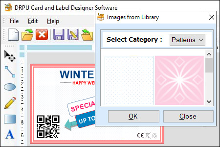
Label designer software is an essential tool for creating customized labels for a wide range of products and applications. One of the key features of label designer software is the ability to use templates and libraries to speed up the design process.
Benefits of Using Templates and Libraries
Using templates and libraries in label designer software offers several benefits to designers:
- Saves Time and Effort: Templates and libraries provide a starting point for label designs, eliminating the need to create a design from scratch. This saves time and effort, allowing designers to focus on other aspects of the design process.
- Consistent Design: Templates ensure that labels have a consistent look and feel, making them ideal for products that require a standardized appearance. Libraries provide a collection of design elements that can be used to create a consistent theme throughout the label design.
- Increased Efficiency: Templates and libraries allow designers to work more efficiently, as they don't need to spend time searching for design elements or creating designs from scratch. This increases productivity and allows designers to complete projects more quickly.
- Professional Appearance: Templates and libraries provide a professional appearance to label designs, even if the designer has limited design experience. This can be particularly beneficial for small businesses that may not have a dedicated design team.
- Customization: Templates and libraries are customizable, allowing designers to modify them to suit their specific needs. This ensures that labels are tailored to the requirements of the product or application.
Conclusion: Templates and libraries are powerful tools in label designer software that can speed up the design process and improve the quality of label designs. They provide a starting point for designs, save time and effort, ensure consistent design, increase efficiency, provide a professional appearance, and allow for customization. By using templates and libraries, designers can create high-quality labels that meet the requirements of their clients and customers.
Best Practices for Creating Interactive Label Designs
Interactive label designs are becoming increasingly popular in today's digital age. They offer an engaging user experience that can help products stand out on the shelves and improve customer engagement. Label designer software offers a range of features that can be used to create interactive label designs, such as hover effects and click events. Best practices for creating interactive label designs using label designer software:-

-
Keep it Simple
One of the key principles of designing interactive labels is to keep it simple. Avoid adding too many interactive elements to the label design, as this can make it look cluttered and confusing. Focus on the most important elements and use interactive features to draw attention to them.
-
Use Clear and Concise Language
Labels are meant to provide information about the product, so it is essential to use clear and concise language in the design. Use short sentences and bullet points to convey important information. Avoid using complex technical jargon that may be difficult for customers to understand.
-
Consider the User Experience
When designing interactive labels, it is essential to consider the user experience. Make sure that the interactive elements are intuitive and easy to use. Use visual cues such as arrows and icons to guide users to the interactive elements.
-
Test the Design
Before finalizing the label design, it is essential to test it on different devices and platforms to ensure that it works as intended. Test the design on different screen sizes, browsers, and operating systems to ensure that it is responsive and works well on all platforms.
-
Use Hover Effects
Hover effects are a popular way to add interactivity to label designs. They can be used to highlight important elements and provide additional information about the product. When using hover effects, make sure that the design is responsive and works well on different devices.
-
Use Animations
Animations can be used to add a dynamic element to label designs. They can be used to highlight important information or draw attention to the product. When using animations, make sure that they are not too distracting and do not slow down the performance of the design.
-
Use Click Events
Click events are another popular way to add interactivity to label designs. They can be used to provide additional information about the product, such as nutritional information or product reviews. When using click events, make sure that they are easy to use and intuitive.
-
Use Color and Contrast
Color and contrast are essential elements in label design, especially when creating interactive designs. Use contrasting colors to make important elements stand out and draw attention to them. Use color to create a visual hierarchy that guides users through the design.
-
Use Typography Effectively
Typography is an essential element of label design, and it is important to use it effectively when creating interactive designs. Use clear and legible fonts that are easy to read. Use different font sizes and weights to create a visual hierarchy and guide users through the design.
-
Consider Accessibility
Accessibility is an important consideration when designing interactive labels. Make sure that the design is accessible to all users, including those with disabilities. Use high contrast colors, clear and legible fonts, and provide alternative text for images.
Conclusion: Creating interactive label designs using label designer software can be a powerful way to engage customers and stand out on the shelves. When creating interactive designs, it is important to keep it simple, use clear and concise language, consider the user experience, test the design, use hover effects and click events, use animations, use color and contrast effectively, use typography effectively, and consider accessibility. By following these best practices, designers can create high-quality interactive label designs that provide a great user experience and help products stand out on the shelves.
