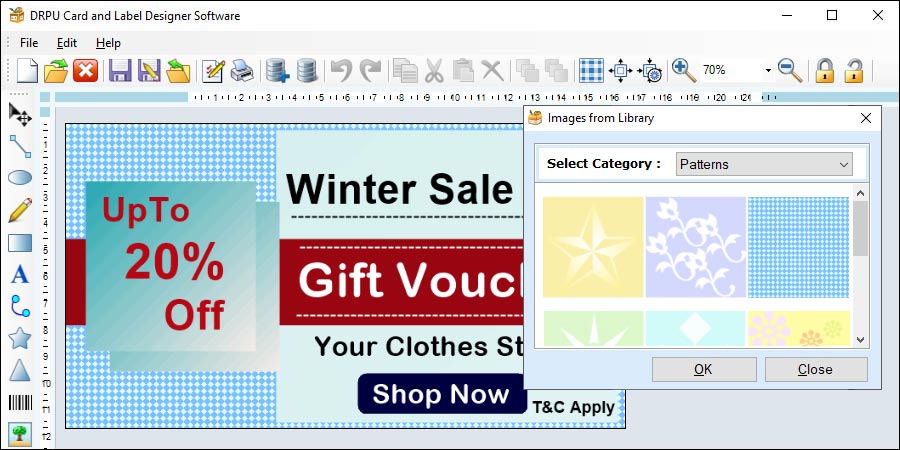
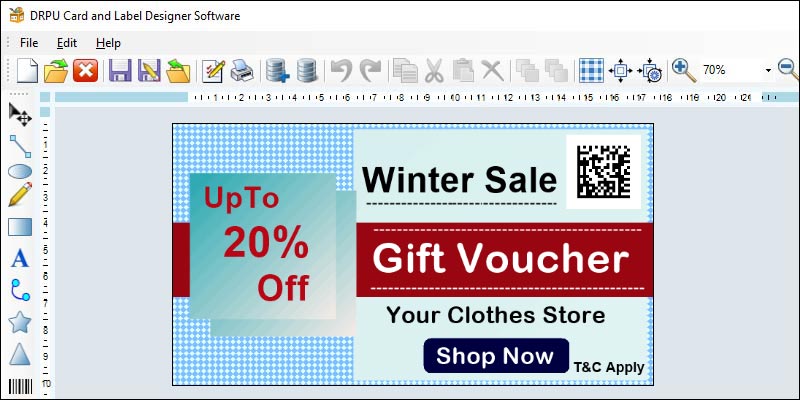
A Template is a pre-designed layout or design that can be customized to meet the user's specific needs. Templates can save time and effort by providing a framework for the design, including placeholders for images, text, and other design elements. Templates can be designed for specific purposes, such as product labeling or packaging, or for specific industries, such as food or medical labeling.
How to use Templates in Label Designer Software
Most label designer software includes a range of pre-designed templates that users can choose from. These templates can be found in the software's library or template folder. Users can select a template that matches their needs, and then customize the design elements to create a unique label.
By using templates, designers can save time and effort in creating a design from scratch, and ensure that their label design is professional-looking and effective.
- Open the software and select "New Label" or "Create a New Design" to start a new label.
- Select "Templates" from the menu bar or toolbar.
- Browse through the available templates and select one that matches your needs.
- Customize the template by adding your own images, text, and other design elements.
- Save the customized template as a new label file.
A library is a collection of design elements, such as images, fonts, and graphics, that can be used in label designs. Libraries can include pre-designed graphics and images, as well as user-created design elements. Libraries can save time and effort by providing a wide range of design elements that can be easily incorporated into label designs.

To use libraries in label designer software,
- Open the software and select "New Label" or "Create a New Design" to start a new label.
- Select "Library" from the menu bar or toolbar.
- Browse through the available design elements and select one that matches your needs.
- Drag and drop the design element onto your label design.
- Customize the design element as necessary.
- Save the label design as a new label file.
How to use Libraries in Label Designer Software
Most label designer software includes a library of design elements that can be used in label designs. Users can access the library from the menu bar or toolbar and browse through the available design elements. Users can then drag and drop the design elements onto their label design.
By using libraries, designers can save time and effort in finding and creating design elements for their label designs. Libraries can also ensure consistency in design elements across multiple label designs.
Creating accessible label designs is crucial to ensuring that all users, regardless of their abilities, can access and understand the information presented on the label. In this article, we will discuss how to make sure your label designs are accessible for all users when using label designer software.
-
Consider color contrast
One of the most important considerations when creating accessible label designs is color contrast. Ensure that there is sufficient contrast between the text and the background color of the label. This is especially important for users with visual impairments, who may have difficulty reading small or low-contrast text.
Most label designer software allows you to choose custom color schemes for your labels, so be sure to choose colors that provide enough contrast. A good rule of thumb is to ensure that there is at least a 4.5:1 contrast ratio between the text and background color.
-
Use large, readable fonts
Using large, readable fonts is another crucial aspect of creating accessible label designs. Avoid using small, decorative fonts that may be difficult for users with visual impairments to read. Instead, choose fonts that are large and easy to read.
Most label designer software allows you to adjust the font size and style, so be sure to choose fonts that are easy to read at a range of sizes. You can also consider using bold or italicized text to emphasize important information on the label.
-
Use clear and concise language
Using clear and concise language is important aspect of creating accessible label designs. Avoid using jargon or overly technical language that may be difficult for users with cognitive disabilities to understand. Instead, use simple, clear language that is easy to read and understand.
Make sure to highlight the most important information on the label, such as the product name, ingredients, and usage instructions. Use bullet points or numbered lists to break up large blocks of text and make it easier to read.
-
Ensure proper labeling and packaging
Ensuring proper labeling and packaging is another important aspect of creating accessible label designs. Make sure that the label is positioned in a way that is easy to read and access. Avoid using packaging that is difficult to open or requires a lot of force to remove.
Consider using braille or other tactile labeling methods to make the label accessible to users who are blind or suffered with visual impairement. This can include embossed text or raised lettering that can be felt by the user.
-
Provide alternative text for images
Providing alternative text for images is another important aspect of creating accessible label designs. Alt text is a short description of an image that is read by screen readers for users who are visually impaired.
Most label designer software allows you to add alt text to images, so be sure to provide a brief description of the image. This will help users who are visually impaired to understand the information presented on the label.
-
Test your label designs
Testing your label designs is a crucial step in ensuring that they are accessible for all users. Conduct usability testing with a range of users, including those with disabilities, to ensure that the label is easy to read and understand.
During usability testing, ask users to provide feedback on the color contrast, font size, language, and overall accessibility of the label. Use this feedback to make necessary adjustments to the label design.
In conclusion, creating accessible label designs is essential to ensuring that all users can access and understand the information presented on the label. By considering color contrast, using large, readable fonts, using clear and concise language, providing alternative text for images, ensuring proper labeling and packaging, and testing your label designs, you can create accessible label designs that are inclusive for all users.
Label designer software is a powerful tool that allows users to create customized labels for various applications. Whether it's for product labeling, packaging, or identification, the design process is crucial to the success of the final product. However, there are several common mistakes that can be made when designing labels that can affect the quality and effectiveness of the label. Some of the most common mistakes to avoid when using label designer software:-

-
Incorrect Bleed Margins
Another common mistake when designing labels is not leaving enough bleed margin. Bleed margin is the extra space around the edge of the label that allows for the printer to cut the label without leaving any white space or borders. If the bleed margin is not set correctly, the label may have white space or borders around the edges, which can be unsightly and unprofessional. It's important to check the printer's specifications and set the bleed margin accordingly.
-
Low Resolution Images
One of the most common mistakes made when designing labels is using low-resolution images. Images that are low resolution will appear pixelated and blurry when printed, which can make the label difficult to read and less visually appealing. It's important to use high-quality images with a resolution of at least 300 dpi to ensure that the label looks sharp and clear when printed.
-
Poor Color Choice
Choosing the right colors for your label is essential to its success. Poor color choices can make the label difficult to read or unappealing to the eye. It's important to use colors that are visually appealing and easy to read, and that complement the product or brand. Colors should be chosen with the printing process in mind, as certain colors may not be achievable with certain printers.
-
Incorrect Font Usage
Fonts play a critical role in the design of a label. The wrong font can make the label difficult to read or unprofessional-looking. It's important to choose a font that is easy to read and complements the design of the label. Additionally, it's important to avoid using too many different fonts, as this can make the label look cluttered and confusing.
-
Overcrowding the Label
Another common mistake when designing labels is overcrowding the label with too much information or design elements. Overcrowding the label can make it difficult to read and less visually appealing. It's important to keep the design simple and clean, with only the essential information and design elements included.
-
Incorrect Label Size
Choosing the right label size is crucial to the success of the label. If the label is too small, the information may be difficult to read, and if it's too large, it may be wasteful and not cost-effective. It's important to consider the product or package size when choosing the label size, as well as the amount of information that needs to be included on the label.
-
Inconsistent Branding
Consistent branding is essential to building brand recognition and trust with customers. Inconsistent branding on labels can make the product or brand appear unprofessional and confusing. It's important to use consistent branding elements, such as logos, fonts, and colors, across all labels and marketing materials.
-
Poor Contrast
Contrast is an essential element of label design. Poor contrast can make the label difficult to read and unappealing to the eye. It's important to choose colors that have high contrast, such as black and white or complementary colors, to ensure that the label is easy to read.
-
Ignoring Regulatory Requirements
Many products have regulatory requirements for labeling, such as the inclusion of certain information or warnings. Ignoring these requirements can result in legal issues or fines. It's important to research and understand the regulatory requirements for the product and ensure that the label includes all necessary information.
-
Not Testing the Label
Finally, one common mistake that designers make when designing labels is not testing the label before it's printed in large quantities. Testing the label is essential to ensure that it meets all of the necessary requirements and that it looks and functions as intended. Testing can include printing a small batch of labels and reviewing them for errors, readability, and design elements. It's also important to test the label on different surfaces and in different lighting conditions to ensure that it remains legible and visually appealing in all situations.
In conclusion, designing labels using label designer software can be a fun and creative process, but it's important to avoid common mistakes that can affect the quality and effectiveness of the final product. By using high-quality images, setting bleed margins correctly, choosing the right colors and fonts, keeping the design simple and consistent, following regulatory requirements, and testing the label before printing, designers can create labels that are visually appealing, functional, and effective in promoting their products or brands.