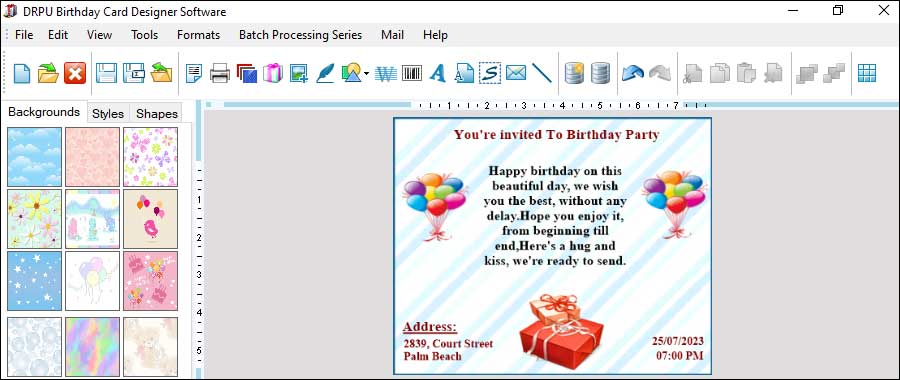
Birthday Card Design: Accessibility, Mistakes, Templates, and Libraries
When creating birthday card designs using birthday card designer software, it is important to consider accessibility for all users. Accessibility means designing for people with disabilities, such as those who are visually impaired or have motor disabilities, so that they can also use and enjoy the birthday cards.
Last Updated On:
Make Sure Your Birthday Card Designs are Accessible for all Users
Here are some best practices for ensuring accessibility in birthday card designs:

-
Use Clear and
Legible Fonts:
Using clear and legible fonts is essential for accessibility. Fonts that are difficult to read or too small can be a barrier for people with visual impairments. Use fonts that are at least 12 points in size and have a high contrast between the text and background. Avoid using decorative fonts that may be difficult to read.
-
Provide Alternative
Text for Images:
Alternative text, or alt text, is a description of an image that is read aloud by screen readers for people with visual impairments. When designing a birthday card, make sure to provide alt text for all images in the design. The alt text should be descriptive and provide the same information as the image.
-
Use High-Contrast
Colors:
Using high-contrast colors can help people with visual impairments distinguish between different elements in the design. Make sure to use colors that have a high contrast, such as black text on a white background, or white text on a dark background. Avoid using colors that are too similar or that may blend together.
-
Provide Keyboard
Shortcuts:
Keyboard shortcuts can be a helpful tool for people with motor disabilities who may have difficulty using a mouse. When designing a birthday card, make sure to provide keyboard shortcuts for all functions, such as saving, printing, and sending the card.
-
Use Descriptive Link
Text:
When including links in a birthday card, make sure to use descriptive link text that describes the content of the link. This is helpful for people who use screen readers and can't see the link's URL.
-
Test the Design with
Assistive Technology:
Testing the birthday card design with assistive technology, such as a screen reader or keyboard, can help identify any accessibility issues. This can help ensure that the design is accessible for all users.
-
Provide Captions or
Transcripts for Videos:
If a birthday card includes a video, make sure to provide captions or a transcript for people who are deaf or hard of hearing. This can help make the content accessible to a wider audience.
-
Consider Different
Disabilities:
When designing a birthday card, it is important to consider different types of disabilities and how they may impact the user's experience. For example, people with color blindness may have difficulty distinguishing between certain colors, so it is important to use high-contrast colors. People with cognitive disabilities may have difficulty understanding complex instructions, so it is important to use simple and clear language.
Conclusion: Ensuring accessibility in birthday card designs is an important consideration for all users. By following these best practices, designers can create designs that are accessible to a wider audience and allow everyone to enjoy and use the birthday cards.
Most Common Mistakes to Avoid when Designing Birthday Cards
Designing birthday cards using birthday card designer software can be a fun and rewarding experience. However, there are some common mistakes that designers should avoid in order to create high-quality designs that meet the client's expectations. Here are some of the most common mistakes to avoid when designing birthday cards using birthday card designer software:
-
Incorrect Bleed Margins: A bleed margin is the area outside of the final trim size of the card where the design extends. This is important to ensure that the design reaches the edge of the card without any white borders. It is important to set up your design with the correct bleed margins (usually 0.125 inches) to avoid any white borders around the card.
-
Poor Color Choices: Using too many colors or colors that clash can result in a chaotic or unappealing final product. When selecting colors for your design, try to limit the number of colors to 2-3 and ensure that they complement each other. Additionally, ensure that the colors are in the correct color mode (such as CMYK) for print.
-
Overusing Clipart and Pre-Made Templates: While it can be tempting to use pre-made templates or clipart in your design, overusing them can result in a generic or unoriginal final product. Instead, try to incorporate unique design elements, such as custom illustrations or typography, to create a personalized and memorable design.
-
Inconsistent Font Usage: Using too many different fonts or inconsistent font sizes and styles can make the design look unprofessional and difficult to read. When selecting fonts for your design, try to limit the number of different fonts to 2-3 and ensure that they are consistent throughout the design.
-
Ignoring the Printing Process: Ignoring the printing process can result in a design that looks different than expected when printed. When designing your card, it is important to consider factors such as paper type, ink type, and printing method to ensure that the design looks as expected when printed.
-
Poor Composition and Layout: Poor composition and layout can make the design look cluttered or unbalanced. When designing your card, try to use design principles such as balance, contrast, and hierarchy to create a visually appealing and easy-to-read design.
-
Low-Resolution Images: Using low-resolution images in your design can result in a blurry or pixelated final product. When selecting images for your design, make sure they have a high resolution (at least 300 dpi) to ensure that they look clear and crisp when printed. Additionally, ensure that the images are in the correct file format (such as JPEG or PNG) and color mode (such as CMYK) for print.
Conclusion: Designing birthday cards using birthday card designer software can be a fun and rewarding experience. However, designers should avoid common mistakes such as low-resolution images, incorrect bleed margins, overusing clipart and pre-made templates, inconsistent font usage, poor color choices, ignoring the printing process, and poor composition and layout to ensure a high-quality final product.
Use Templates and Libraries to Speed up the Design Process
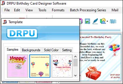
Using templates and libraries is an excellent way to speed up the design process when using birthday card designer software. Templates and libraries are pre-designed elements that can be customized and used in your design. This saves time and effort because you don't have to create everything from scratch.
