Written by : 👤 Techsavvy
Posted On : 📅
Read Time : 🕔 8 Minutes
Design a Business Card that Effectively Represents your Brand
-
Start with your brand identity: Before you start designing your business card, make sure you have a clear understanding of your brand identity. This includes your brand values, personality, and key messaging. Your business card should reflect and reinforce your brand identity to potential customers.
-
Choose the right colors: Colors can play a powerful role in communicating your brand message. Choose colors that reflect your brand identity and reinforce your messaging. Consider the psychology of color and how different colors can evoke different emotions and perceptions.
-
Use clear and readable typography: Make sure your business card is easy to read and understand. Choose a clear and readable font that reflects your brand identity and is consistent with your marketing materials. Make sure the font size is large enough to be read easily.
-
Keep it simple: Don't overload your business card with too much information or design elements. Keep the design simple and focused on your key message. This will help ensure that your business card is easy to read and understand.
-
Use high-quality images and graphics: If you use images or graphics on your business card, make sure they are high-quality and reflective of your brand identity. Avoid using low-quality or pixelated images, as they can give the impression of an unprofessional brand.
-
Include your key messaging: Your business card should communicate your key messaging to potential customers. This can include your tagline, unique selling proposition, or other messaging that communicates the value you offer to customers.
-
Consider different formats: While the traditional 3.5" x 2" business card is the most common format, there are other formats that can help your business card stand out. Consider using a square or folded business card, or adding a unique shape or texture to your card.
-
Make sure it's legible for all audiences: Your business card should be legible and readable for all audiences, including those with visual impairments. Consider using a larger font size or high-contrast colors to ensure that your message is clear to everyone.
-
Test and refine: Once you've designed your business card, test it with potential customers or colleagues to get feedback. Refine the design based on feedback to ensure that it effectively represents your brand and communicates your message.
The Essential Elements of a Business Card and Incorporation
A business card is a critical marketing tool that can make or break a first impression. To create an effective business card, you need to incorporate the essential elements into your design. Here are some essential elements of a business card and how to incorporate them into your design using business card designer software:

-
⮊
Contact information:
The primary purpose of a business card is to provide contact information, so include your name, job title, phone number, email address, and website address. If you have a physical address or social media accounts, you may also include them. Make sure to keep the information concise and legible.
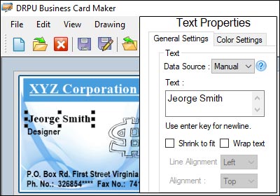
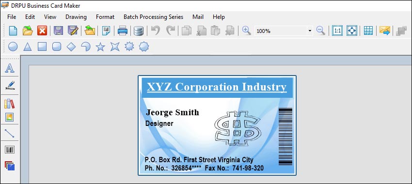
To incorporate contact information into your design using business card designer software, use text boxes or fields for each piece of information. Make sure the font size is large enough to be easily read, and consider using different font sizes or styles to distinguish between different types of information.
-
⮊
Branding:
Your business card should reflect your brand identity, so incorporate your brand colors, logo, and other branding elements into your design. Your business card should be consistent with your other marketing materials, such as your website or social media profiles.
To incorporate branding elements into your design using business card designer software, use color palettes or templates that reflect your brand identity. You can also upload your logo or other branding images and incorporate them into your design.
-
⮊
Design elements:
Design elements, such as patterns, textures, or images, can help make your business card stand out and reinforce your brand identity. However, be careful not to overload your design with too many elements, as this can make it look cluttered and unprofessional.
To incorporate design elements into your design using business card designer software, use templates or design tools that allow you to add patterns, textures, or images. Make sure the design elements are consistent with your brand identity and reinforce your key messaging.
-
⮊
Typography:
Typography can play a critical role in the legibility and overall aesthetic of your business card. Choose a font that is easy to read and consistent with your brand identity. Consider using different font sizes or styles to highlight different pieces of information.
To incorporate typography into your design using business card designer software, choose from a range of fonts and font styles that are consistent with your brand identity. You can also adjust font sizes and styles to highlight different pieces of information.
-
⮊
White space:
White space, or negative space, is the area around and between design elements. Using white space effectively can help make your business card look clean and uncluttered, and can make it easier to read.
To incorporate white space into your design using business card designer software, make sure to leave enough space between design elements. Consider using templates or design tools that incorporate white space effectively.
In conclusion, incorporating essential elements into your business card design is critical to creating an effective marketing tool that can help you make a great first impression. To incorporate these elements into your design using business card designer software, use templates or design tools that allow you to add contact information, branding, design elements, typography, and white space effectively. By doing so, you can create a business card that effectively communicates your message and helps you build a strong and successful brand.
The Best Practices for Creating a Business Card
In today's competitive business world, having a memorable and eye-catching business card can be a great way to stand out from the crowd and make a lasting impression on potential customers or clients. Here are some best practices for creating a business card that stands out and is memorable:

-
Use imagery wisely:
Including imagery on your business card can help make it more visually appealing, but be sure to use it wisely. Choose images that are relevant to your brand and help communicate your message, and avoid using low-quality or pixelated images that can detract from your card's overall impact.
-
Keep it simple:
While it's tempting to try to cram as much information as possible onto your business card, a cluttered design can be overwhelming and difficult to read. Keep your design simple and focused, with only the essential information that potential customers or clients need to know.
-
Include a call to action:
Including a call to action on your business card can help encourage potential customers or clients to take action, such as visiting your website or contacting you for more information. Consider including a special offer or discount that is only available to those who present your card.
-
Incorporate your branding:
Your business card should be an extension of your brand, so be sure to incorporate your logo, color scheme, and other branding elements into your design. This will help ensure that your card is consistent with your overall brand identity.
-
Make it interactive:
Adding a unique and interactive element to your business card can help make it more memorable. Consider adding a QR code that leads to your website or social media profiles, or including a scratch-off element that reveals a special offer or discount.
-
Use typography effectively:
Choosing the right font can make a big difference in how your business card is perceived. Be sure to use a font that is easy to read and complements your brand, and consider using different font styles to create visual hierarchy and draw attention to important information.
-
Use high-quality materials:
One of the first things people notice about a business card is the quality of the materials used to make it. Using high-quality paper stock or other materials, such as metal or plastic, can help your business card stand out and feel more substantial.
-
Consider alternative shapes:
While traditional rectangular business cards are the norm, using a different shape can help your card stand out and be more memorable. Consider using a die-cut shape or a unique fold to create a more interesting and eye-catching design.
-
Use bold colors:
A pop of color can make your business card stand out and grab people's attention towards your brand. Consider using bold and bright colors that complement your brand and make your card more memorable.
-
Get feedback:
Before finalizing your business card design, be sure to get feedback from others. Show your card to colleagues, friends, or family members and ask for their honest opinions. Incorporate their feedback into your design to ensure that your card is as effective and memorable as possible.
